At-a-glance
I started working with InTomorrow as a UX/UI designer at the beginning of 2023. Starting from scratch, I worked to design a hybrid mobile application through user research, problem-defining, ideation, wireframing, prototyping, and user testing. During the time I’ve worked on this project, I delivered a design system, a complete set of app design, and worked closely with a full-stack developer to achieve a result that was eligible for release on the App Store and Google Play Store in October 2023.
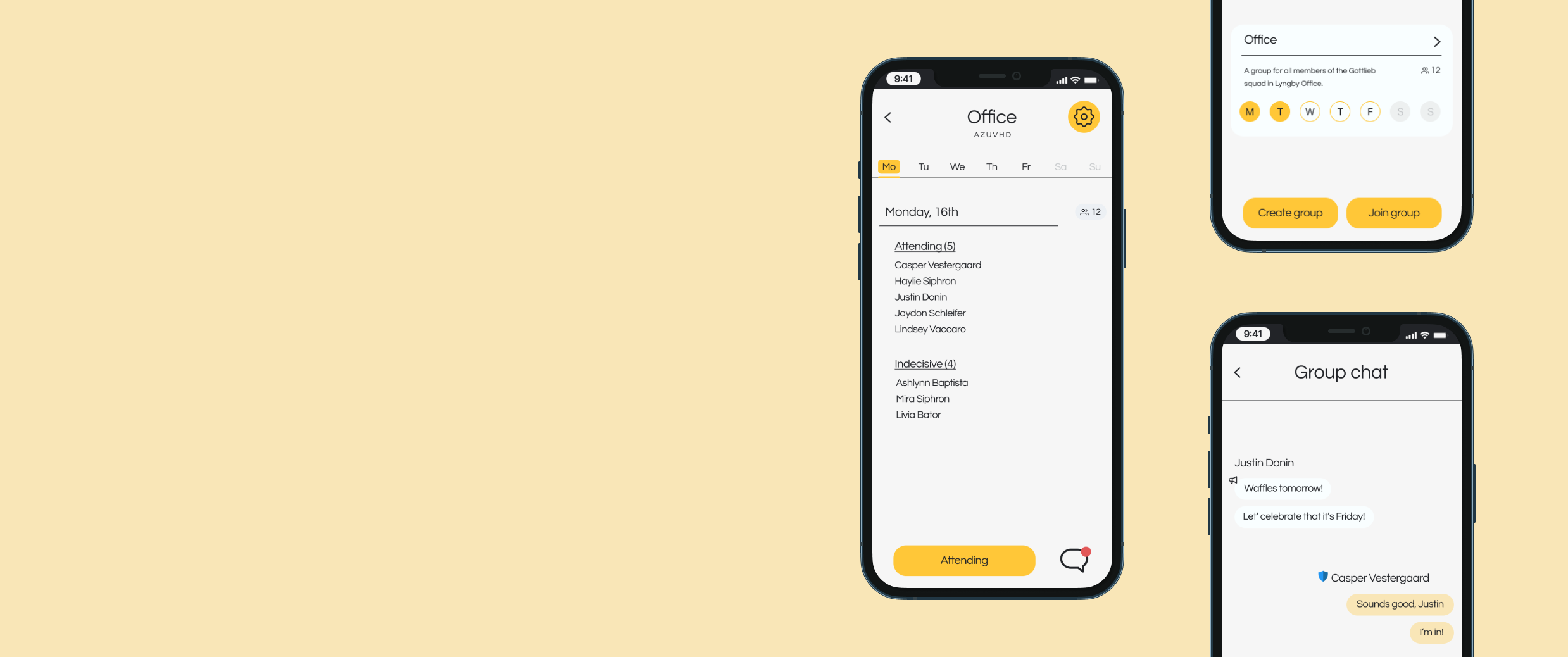
In Tomorrow is an application designed to make planning a hybrid office week easy and enjoyable for the team. In essence, it shows an overview of who will be at the office, and who will be available from home on a given day of the week.
Timeline
March 2023 - January 2024
My role
UX/UI Designer
Collaboration
1 Full-stack developer
Platform
Figma


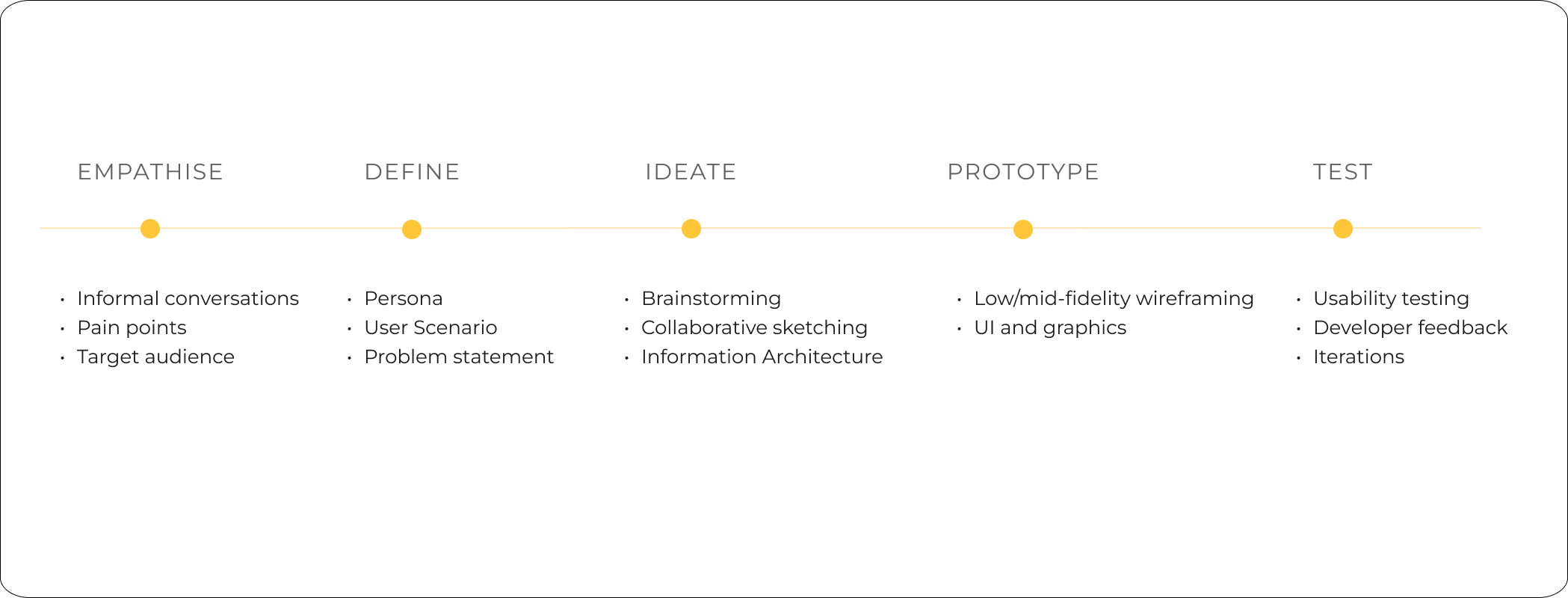
To gain some insight into how our target users think, I had informal conversations with a range of people about the concept of In Tomorrow. I wanted to understand how this application could improve a hybrid-office situation, and realise which pain-points a potential user could have. The most common findings were as follows:
Key findings
Lack of overview: People are frustrated because they do not know whether people are coming to work or staying at home.
Lack of social interaction: People tend to stay more at home when they are uncertain of how many people will come in to office on a specific day.
Planning is difficult: Facilitation of workshops and meetings can be improved with an overview of how many will join remotely vs. physically.
Lack of platform: Current platforms lack consistency and ease of use. People communicated a need for an easy solution that gives more direct information.

The problem
Hybrid office workers need a way to quickly and easily access an overview of remote vs. physical co-workers, because lack of this information leads to frustration and uncertainty. If we can design a tool to solve this problem, we can help them facilitate meetings, workshops and activities easier, as well as promote a more social workplace.
The goal
How might we make it easier for hybrid office workers to show if they are working from home or coming in to the office, as well as give them an overview of their coworkers’ statuses?
The user
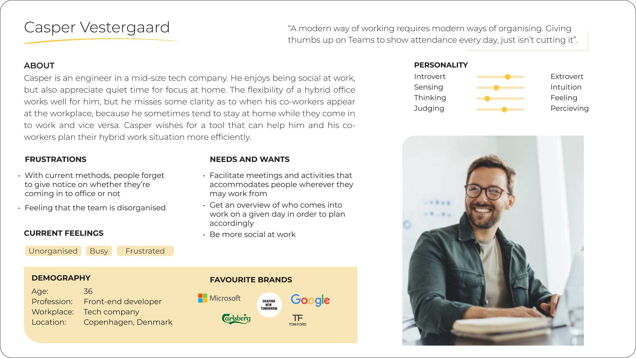
Our primary target user Casper, is a result of a synthesis of key points from my research. Having a persona makes it easier to communicate design decisions, and consider our user as a real person.

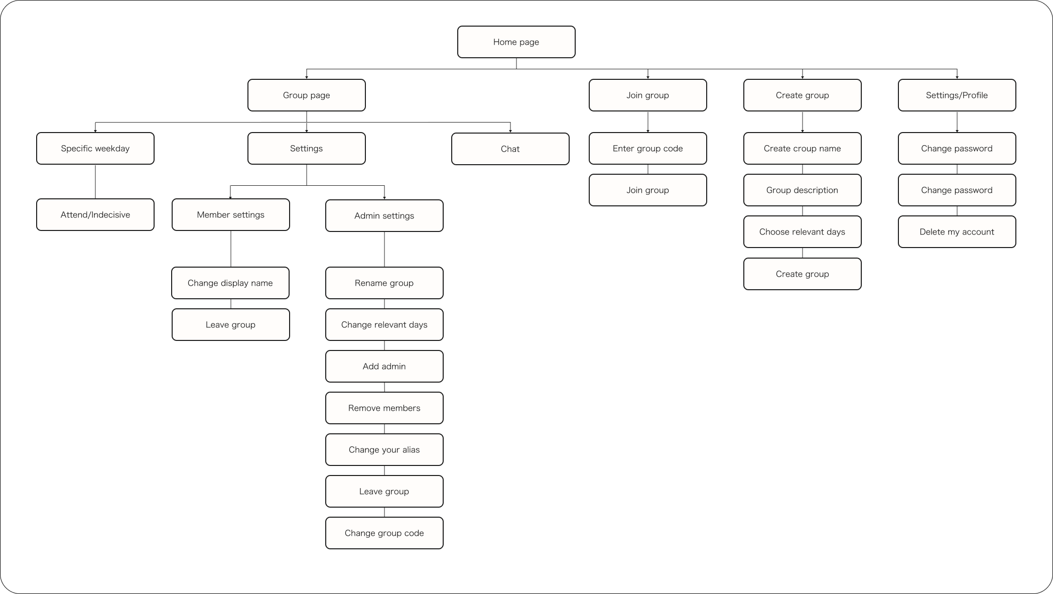
The IA would help me and the developer to stay aligned in our understanding on how the application was built and layered. As the application went through many phases of iteration, continuously updating the IA proved useful as a common framework.

After mapping out the main features of the application, I did some collaborative sketching with the developer, before I transferred the sketches into low-fidelity wireframes in Figma. Below are some of my thought processes behind the design decisions.
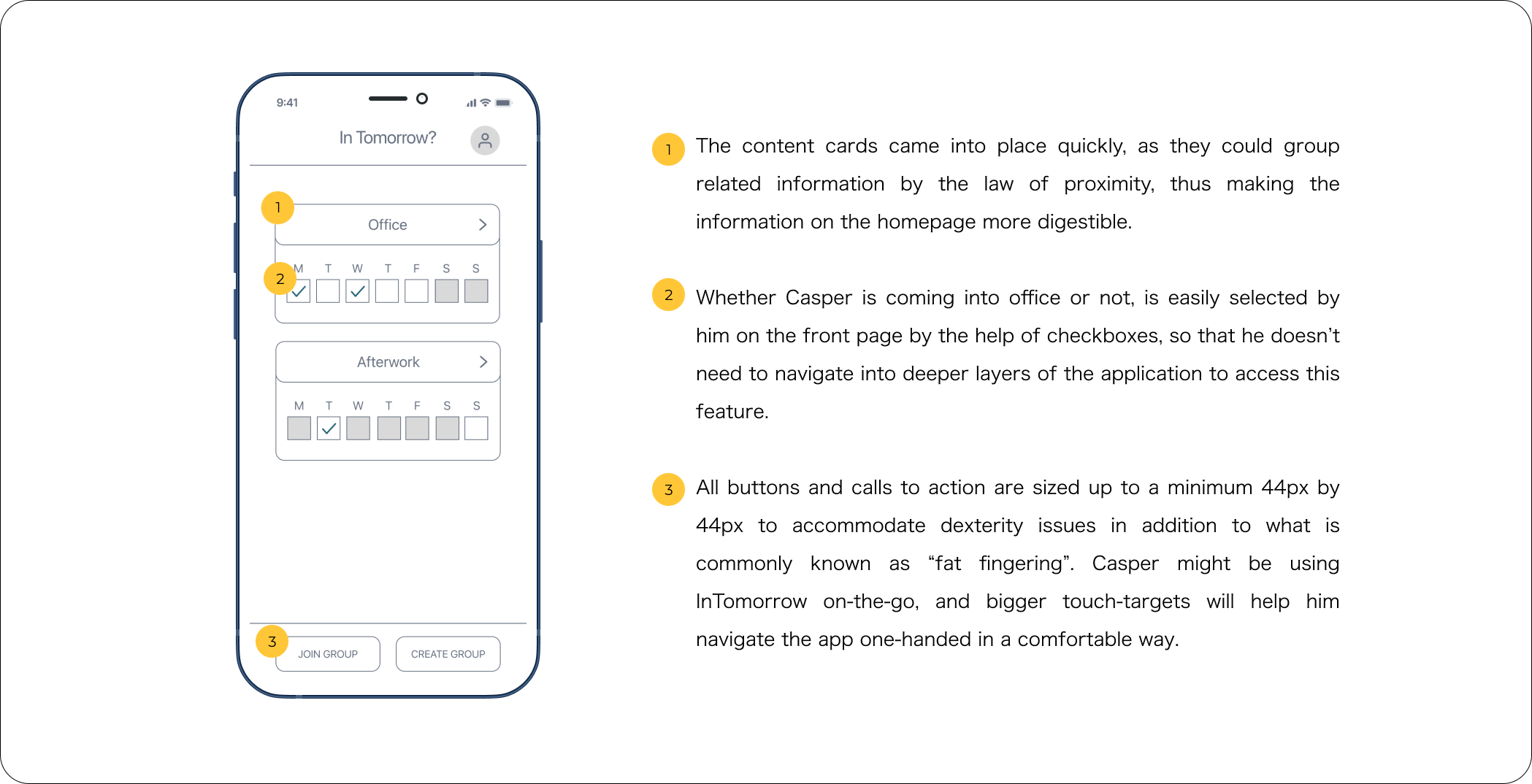
Homepage
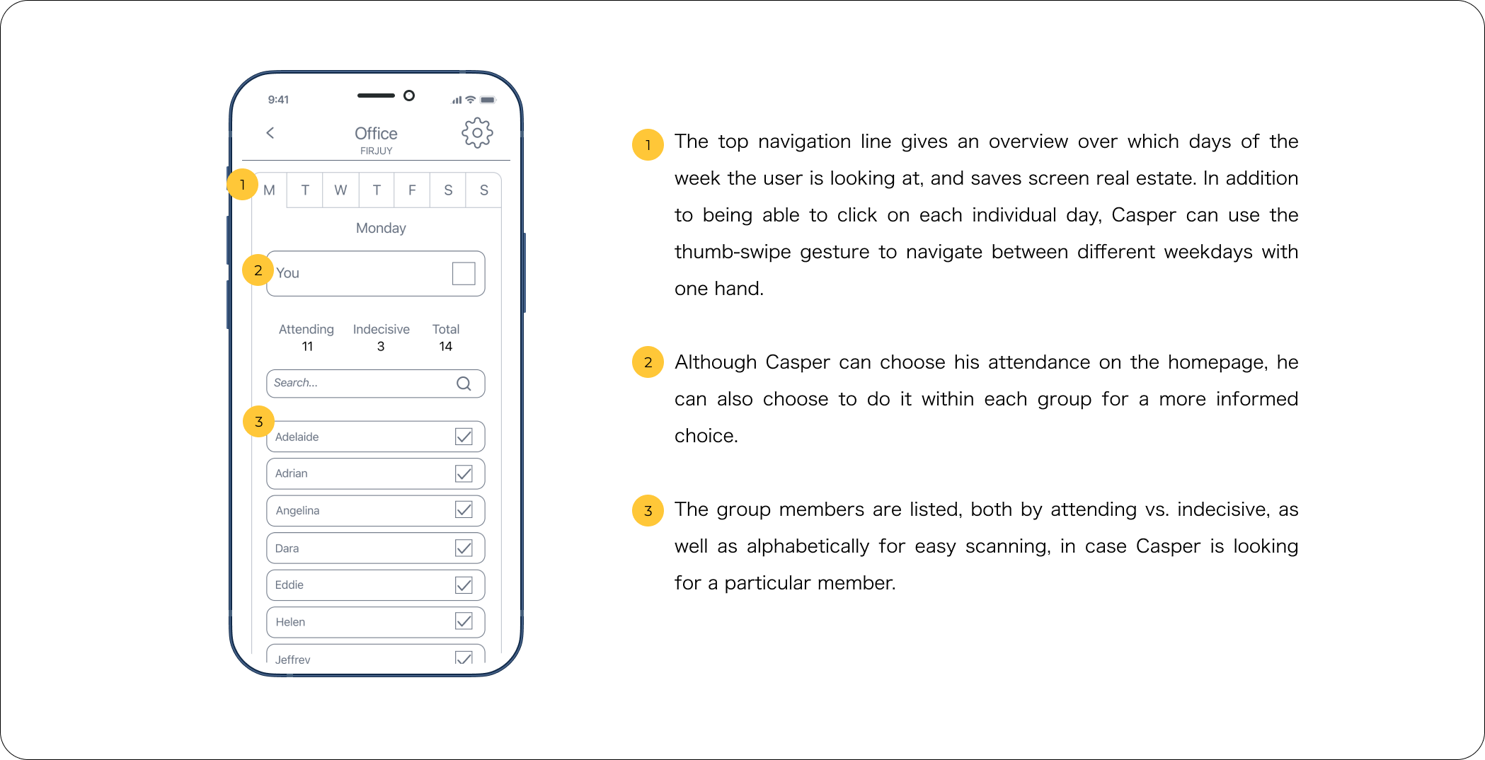
The main challenge for the homepage was to give the user an overview of their groups, while simultaneously be able to confirm their choice of coming or not on any given day. Casper is a busy worker, and it was fundamental for us to give him an overview of the main information that he can understand at a glance, without exposing him to decision fatigue (Hick’s Law).
Group overview
I wanted to make it easy for Casper to join and create a group. I came up with the idea with using a group code to make the flow seamless. The only thing he needs to join a group is to know the group code, add it to an input field and proceed, with no additional password or approval. This makes groups more accessible.
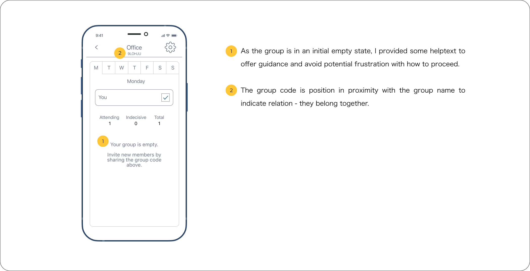
Group overview - empty state
Casper might create groups, and thereby encounter an empty state. Considering this in design is important, as this gives an opportunity to guide the user towards the next possible action.

Prototyping
As the wireframes took shape, they were wired together to create a prototype for testing.

Low-fi prototype usability testing
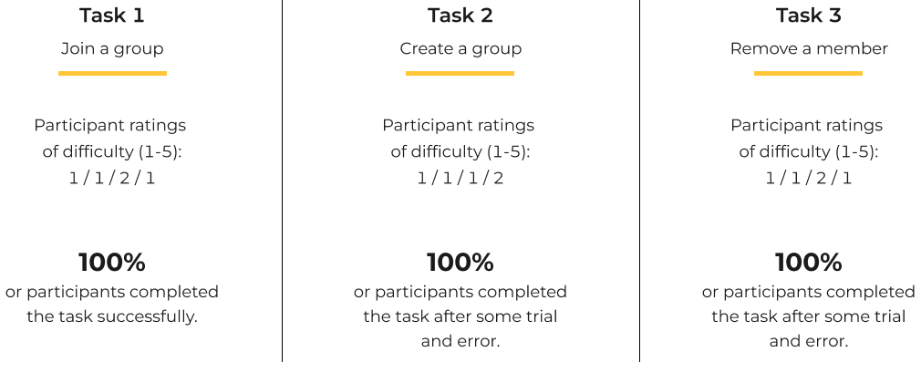
Testing the low-fi prototype was paramount, as it would help me find out if the layout, navigation and functionality of the application was understandable. It was important to gain this insight early on in the process, to save time with further implementation of the design. To make sure that the user explored the desired functions, I lines up three separate flows:
1: Join a group and make your status visible.
3: Create a group and find the group code.
2: Remove a member from a group you administer.
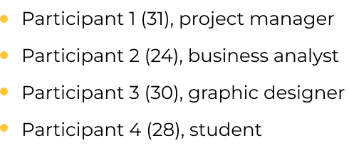
After conducting a pilot test to ensure that the script and prototype was up to par, I tested the application with 4 different users who fit my screening. I was looking for participants with the opportunity of working/studying both at the workplace and at home.
Executive summary
The user test confirmed the application design and direction, and all applicants understood the purpose of the app. The tasks given were understandable and possible to complete. However, after affinity mapping the test results, it lead to three important findings:
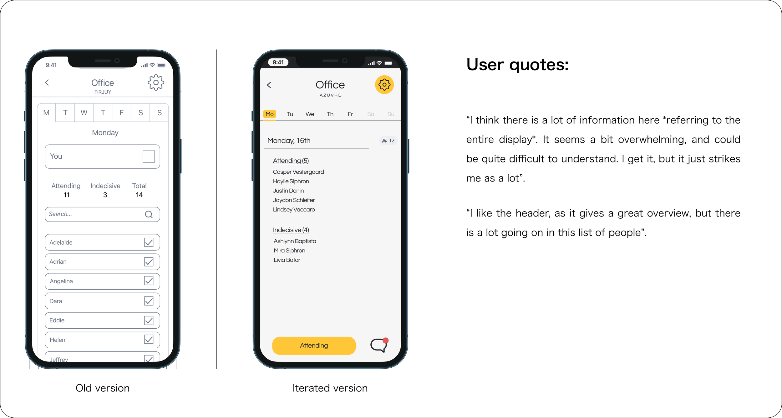
1. Users can feel overwhelmed when there is too much information on the screen.
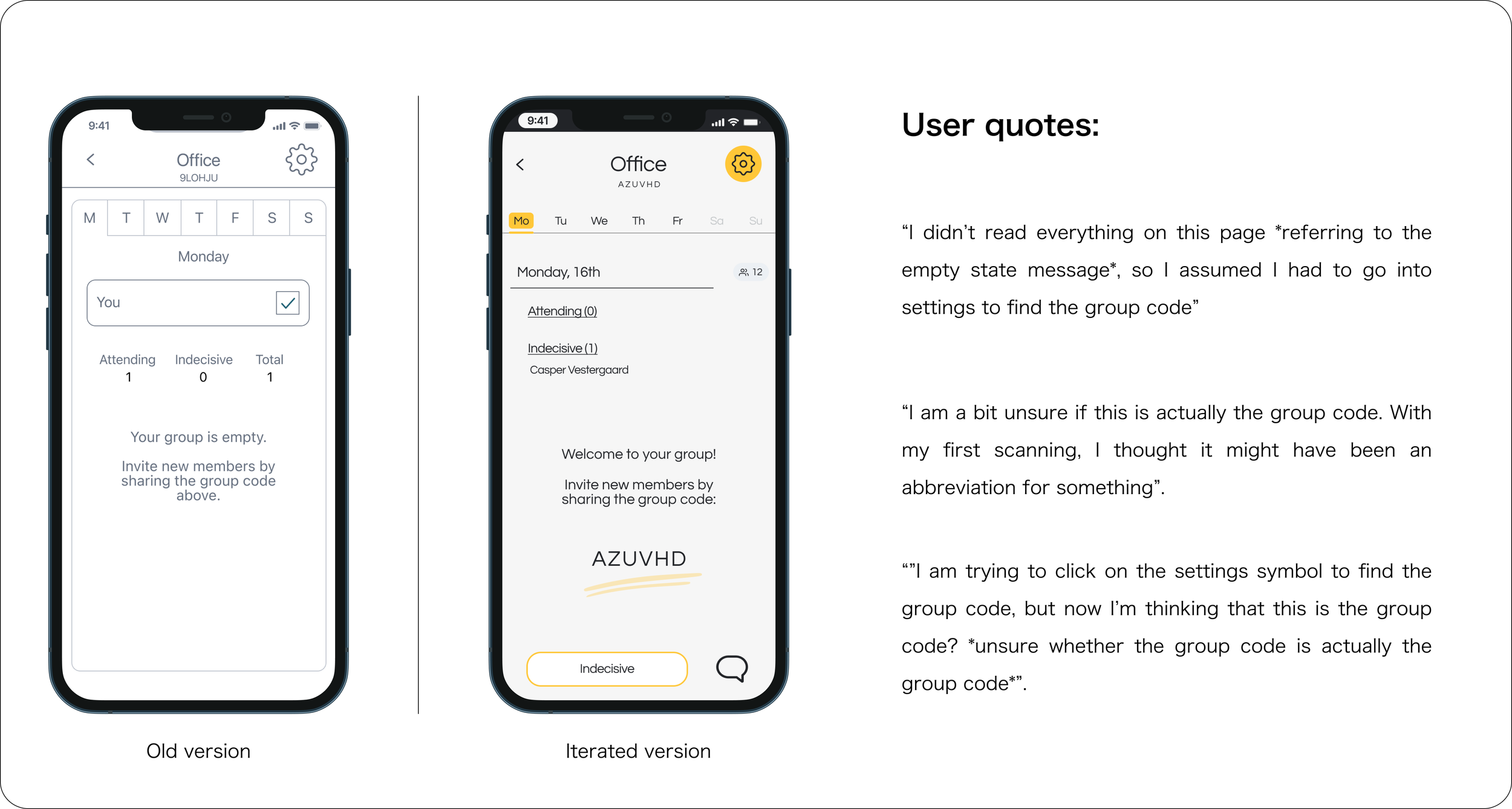
2. Users scan for information, and might therefore miss crucial details.
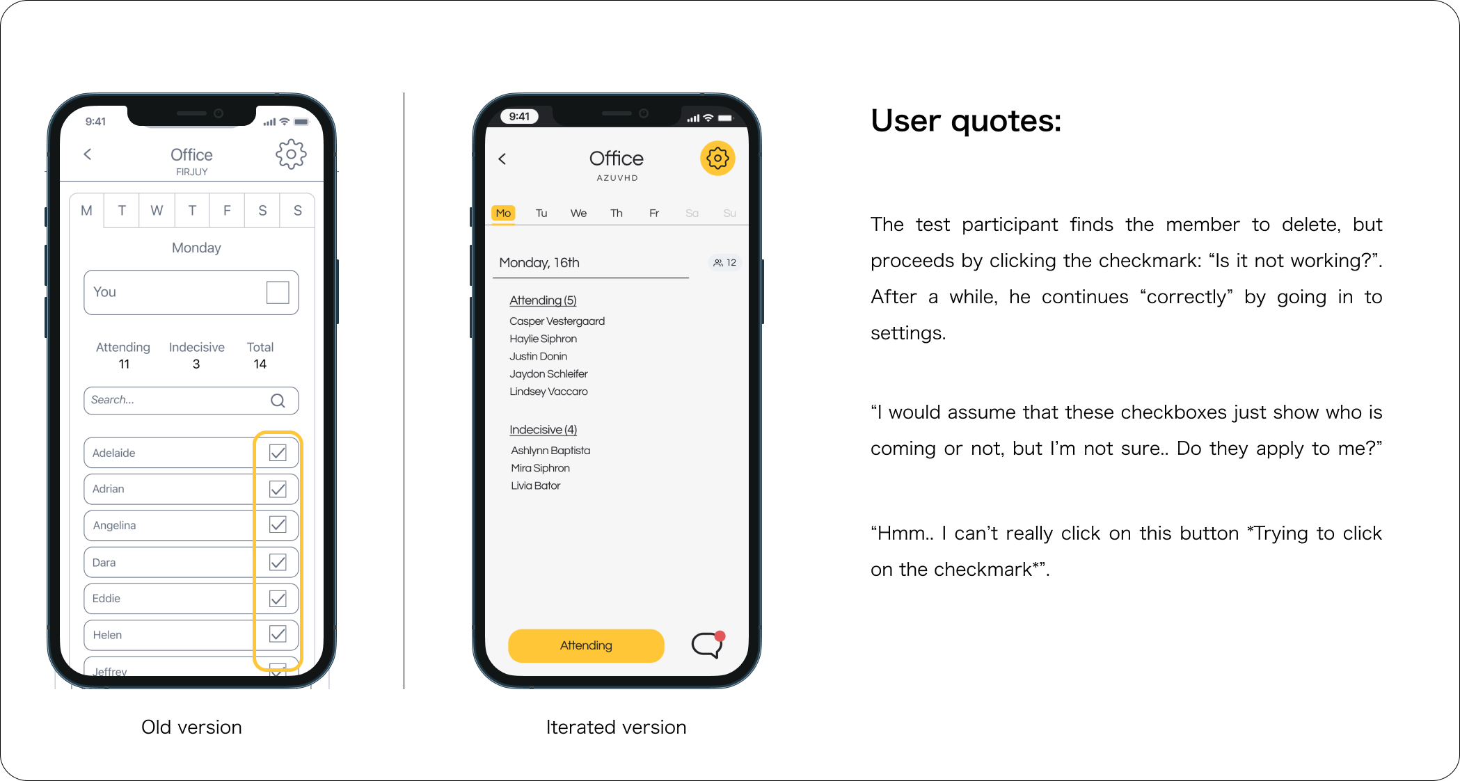
3. Users can be mislead when elements behave in an unpredictable way.
Reporting on metrics
1. Users can feel overwhelmed when there is too much information on the screen.
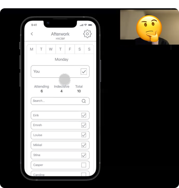
The group display-wireframe caused confusion for the test participants. Though it didn’t prevent them from completing the task, they reported that it seemed crowded and overwhelming. For the iteration, I restructured the member list, minimised the header and ditched the personal checkbox in favour of an “attending”-button at the bottom of the screen. This allowed for more breathing room between elements and offered more structure. I also added dates to the weekdays for orientation.
2. Users scan for information, and might therefore miss crucial details.
The test showed me the importance of content hierarchy, and how the absence of this can make the user feel confused and lost. To help the user achieve their task, I had to make the group code more visible to make it stand out from the other elements. Considering the first thing a user might do is create a group and invite new members, it is crucial that the code is located quickly.
3. Users can be mislead when elements behave in an unpredictable way.
My initial thought when designing the group overview was: “To create a consistent look and feel, I should use checkboxes to highlight a member’s status of whether they are attending or not”. However, checkboxes have affordancs that make you assume they can be interacted with. Therefore, some of the test participants understandably tried to click on these to proceed with the delete member task. To fix this problem, I removed the member checkboxes altogether, and used clear headings to display member status.

Continuously working with In Tomorrow from start to release has been an exciting journey, as the intent of this project was to craft a real-life product. Seeing users interact with the application and putting it to use is rewarding!
Working with a developer has been particularly insightful, as the need for prioritization became a prominent factor in the direction of the design. Being able to switch from a non-feasible design from a developer perspective to a design that was actually possible to implement, often had me switching between different ideas and kept me ready to change things up.
I will continue exploring user pain points in app behavior and interface through user testing, in order to improve the design in future iterations.


