Your climbing gym in your pocket
UX/UI Designer
User Researcher
MY ROLE
TEAM
Team of two; me and a full stack developer
Component library
Design System
User testing
Marked research
DELIVERABLES
Sketches
Low-fi/hi-fi wireframes
Prototype
Imagine one app that lets climbers log routes, track progress, compete, connect with others, and stay updated on their local gym. IntoClimb brings this vision to life.
The WHAT
Climbers need a way to track progress and connect, while gyms and route setters seek tools for route setting and competitions. IntoClimb brings it all together.
The WHY
Understanding the needs of climbers, gym owners, and route setters was key. Close collaboration with them and the developer turned the concept into reality.
The HOW
Climbing gyms want a channel to reach out to their users, foster community and market themselves to their climbers.
Business problem
Frequent climbers find it difficult to log and track climbing progress, and feel a sense of community with their gym.
User problem
User research
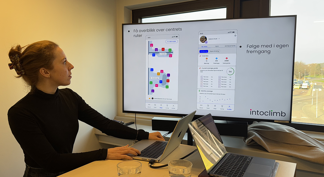
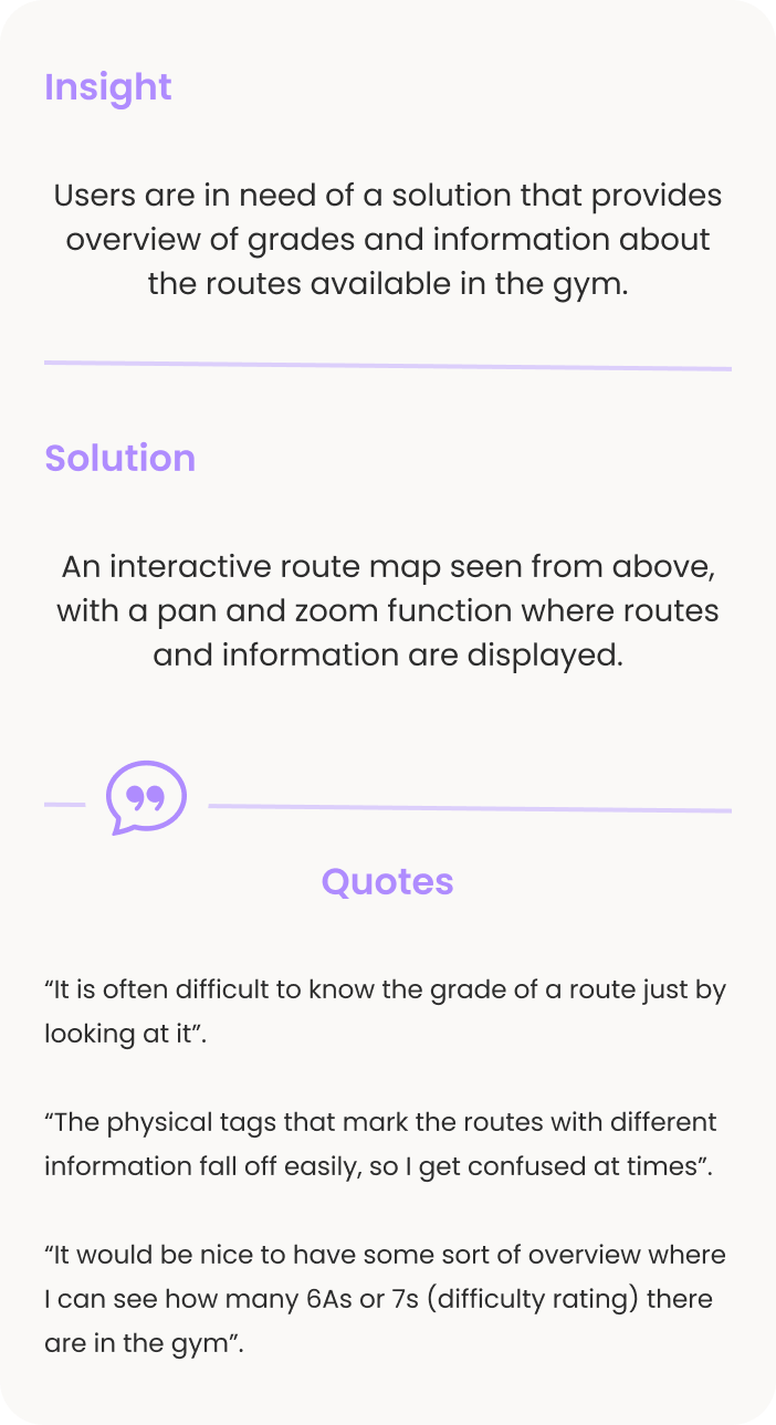
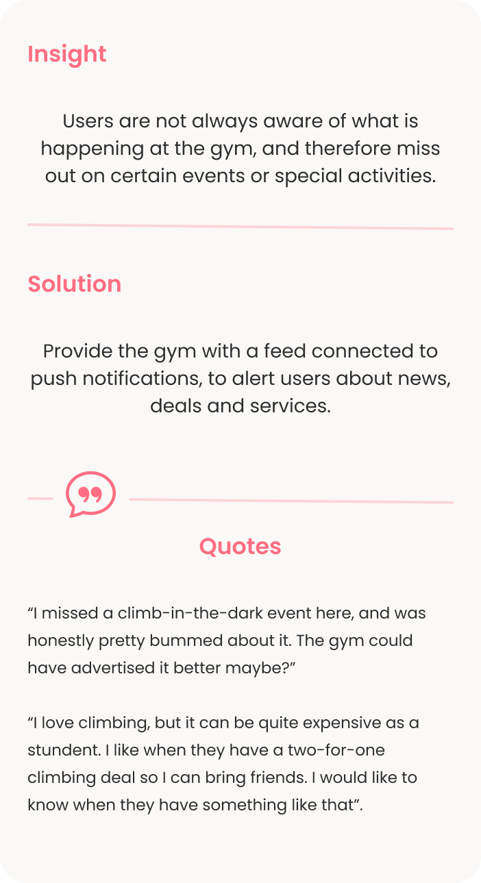
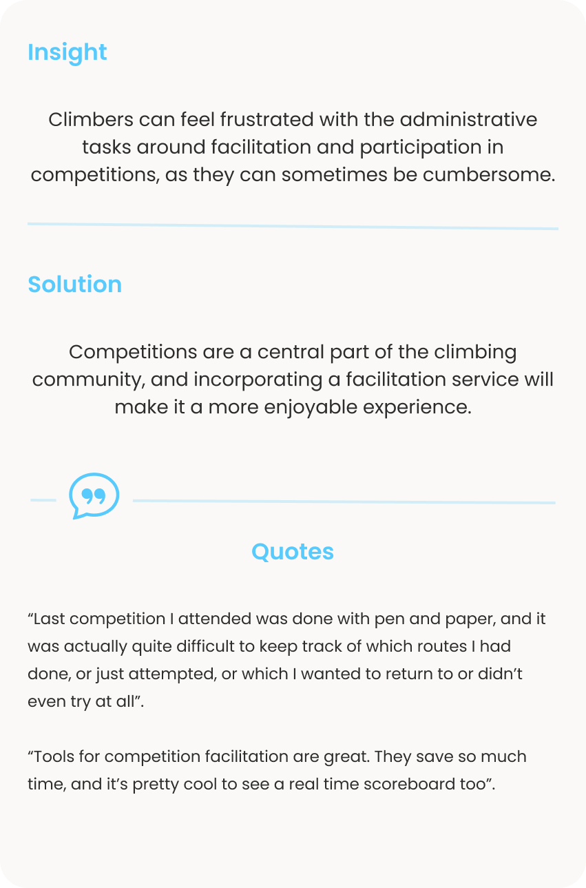
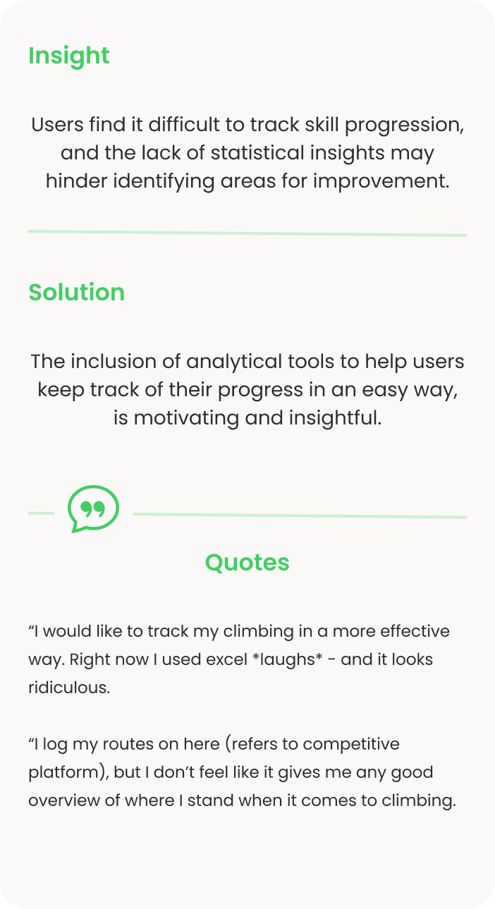
In addition to conducting a survey to gather insights from a large audience, I held in-person interviews at two climbing gyms in Copenhagen to capture a diverse range of perspectives. These findings revealed several key insights:
Competitive analysis
I mapped out both direct and indirect competitors to better understand intoclimb's positioning. While analyzing numerous platforms, I identified only two direct competitors. Combining insights from user research and competitive analysis, I revealed several areas where intoclimb could be better than its competitors:
Gym value stream: Current solutions lack features that allow the gym to reach out to their users. With a feed and shop access, the gym could boost their return of investment.
Customisation: Existing platforms offer limited customisation, a key feature desired by paying customers.
Navigation: Poor information hierarchy in current apps leads to confusing navigation, frustrating users.
Modern Design: Many competitors feel outdated, with technical issues and poor optimisation for native platforms.
Zoom in for details.
Table showing my competitive analysis. Names of competitive platforms are censored.Information architecture
I developed the information architecture to align the teams basic understanding of the product and provide a framework for discussion. We then used sticky notes and stamps to encourage informal, creative collaboration, helping us refine and expand on our ideas.
Zoom in for details.
Sketching low-fi wireframes
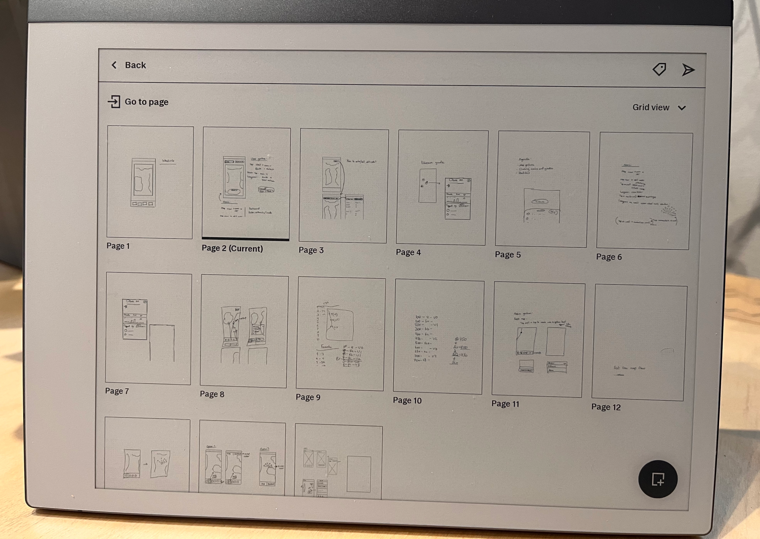
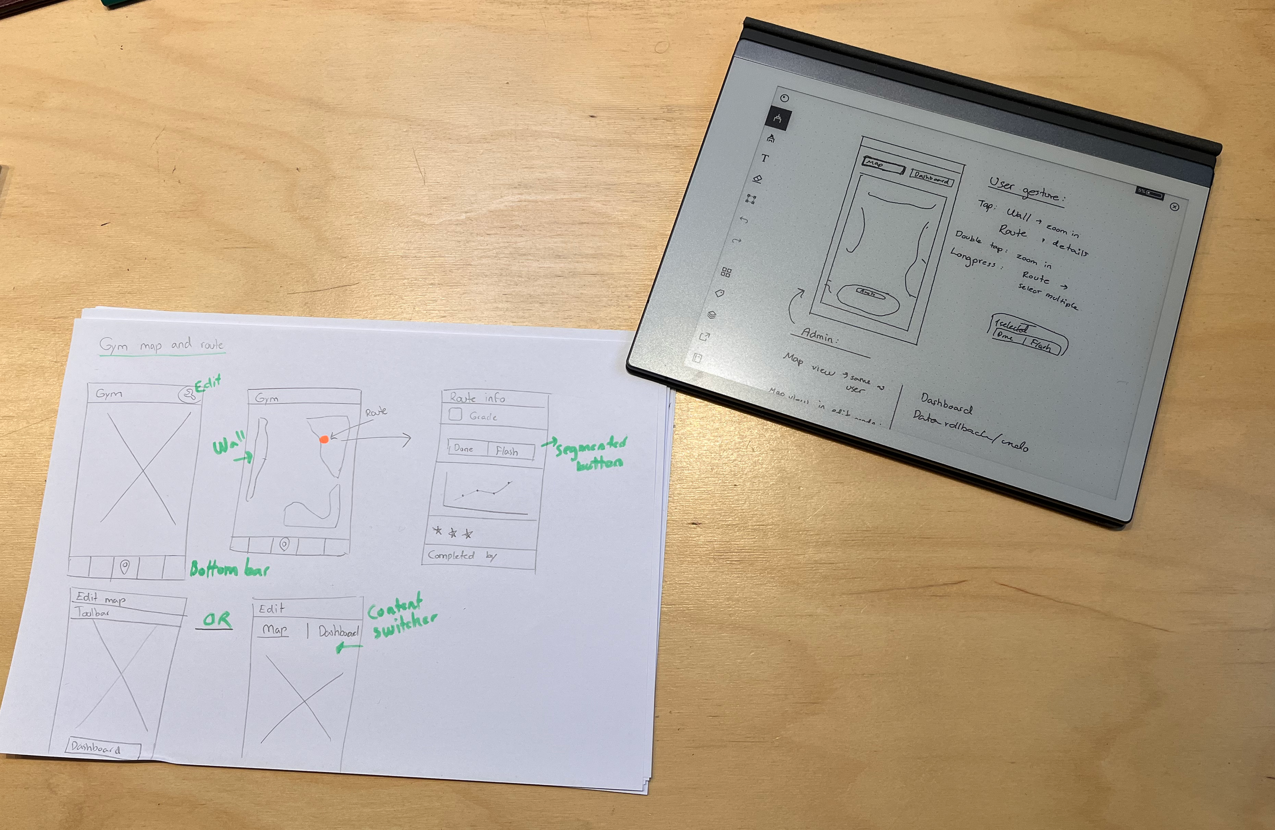
I started with quick pen-and-paper sketches to brainstorm and iterate ideas. The most promising concepts were then developed into low- to mid-fidelity prototypes in Figma.
I carry my Remarkable with me to quickly sketch or write when I get feedback or ideas from key users, or if I want to articulate decisions and explore concepts when discussing with the developer.
Sketching on my Remarkable.Digital sketches and sketches on paper. Both have their pros and cons.Simplified design process
I will take you through a visualisation of what my design process could look like, by using one aspect of the application;
The route setting process.
First, I normally start out mapping the user flow based on research. Here I took part in a route setting session at a climbing gym in order to get a feel of how the route setters operate. I then put together this flow:
Zoom for more details.
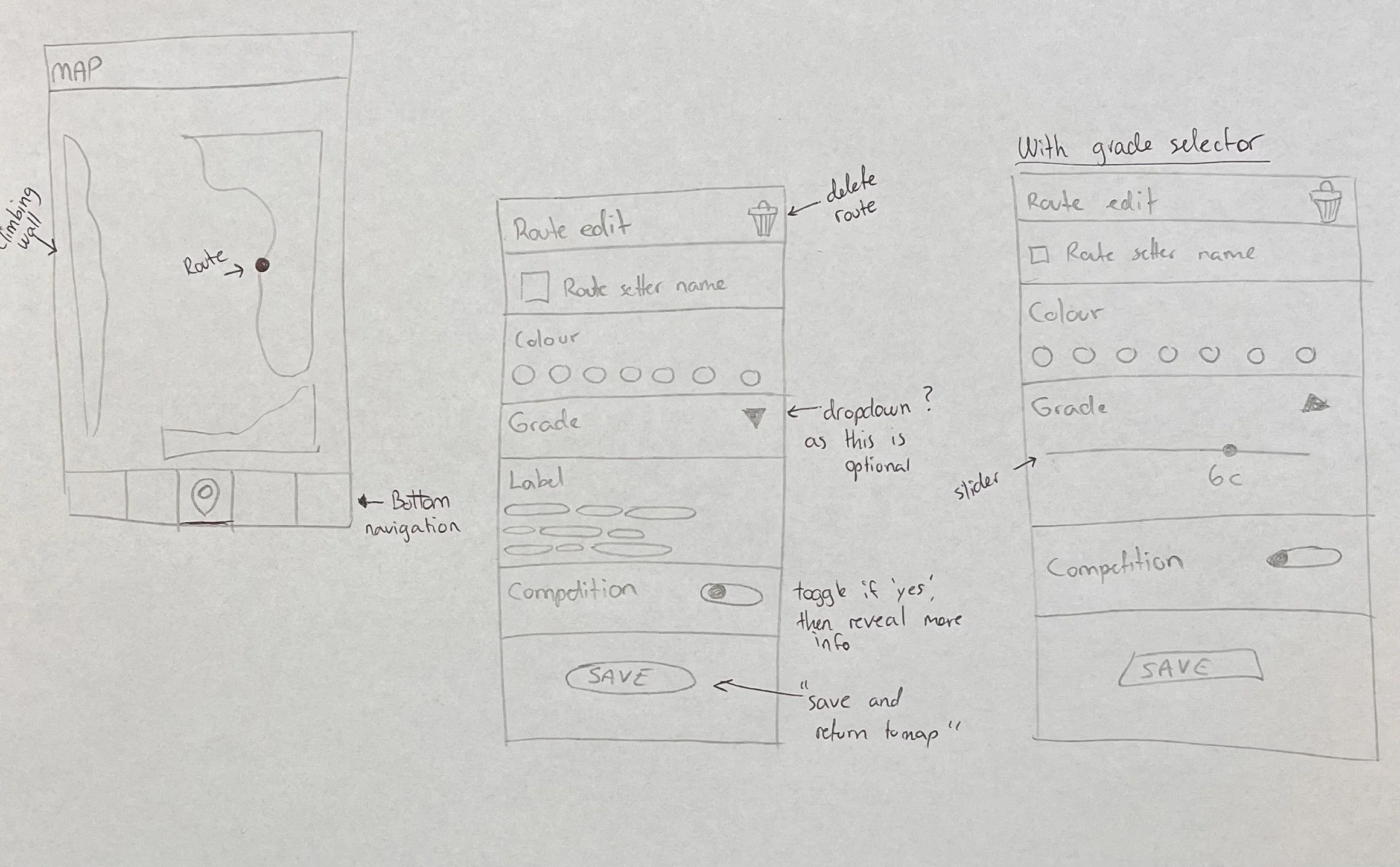
Then I sketch out, either on paper, post-it notes or on a tablet - or directly into Figma, depending on where I am and which tools are available.
I annotate my design so it’s easier to share with others, but also as a reminder to myself in case it will take some time before the sketch is incorporated in the design.
Through mid-fidelity designs I am also able to quickly work with (and change) different versions of the same idea, without spending too much time converting it to high-fidelity.
While converting into high-fidelity wireframes, I also elaborate on my annotations so they makes sense through a UX perspective, but also as a digital form of communication with the team developer (and my future self).
I then test, research and iterate based on feedback and new knowledge. The more I worked with climbers and route setters, the better understanding I got of the field and understood more small details that could improve our product.
Testing
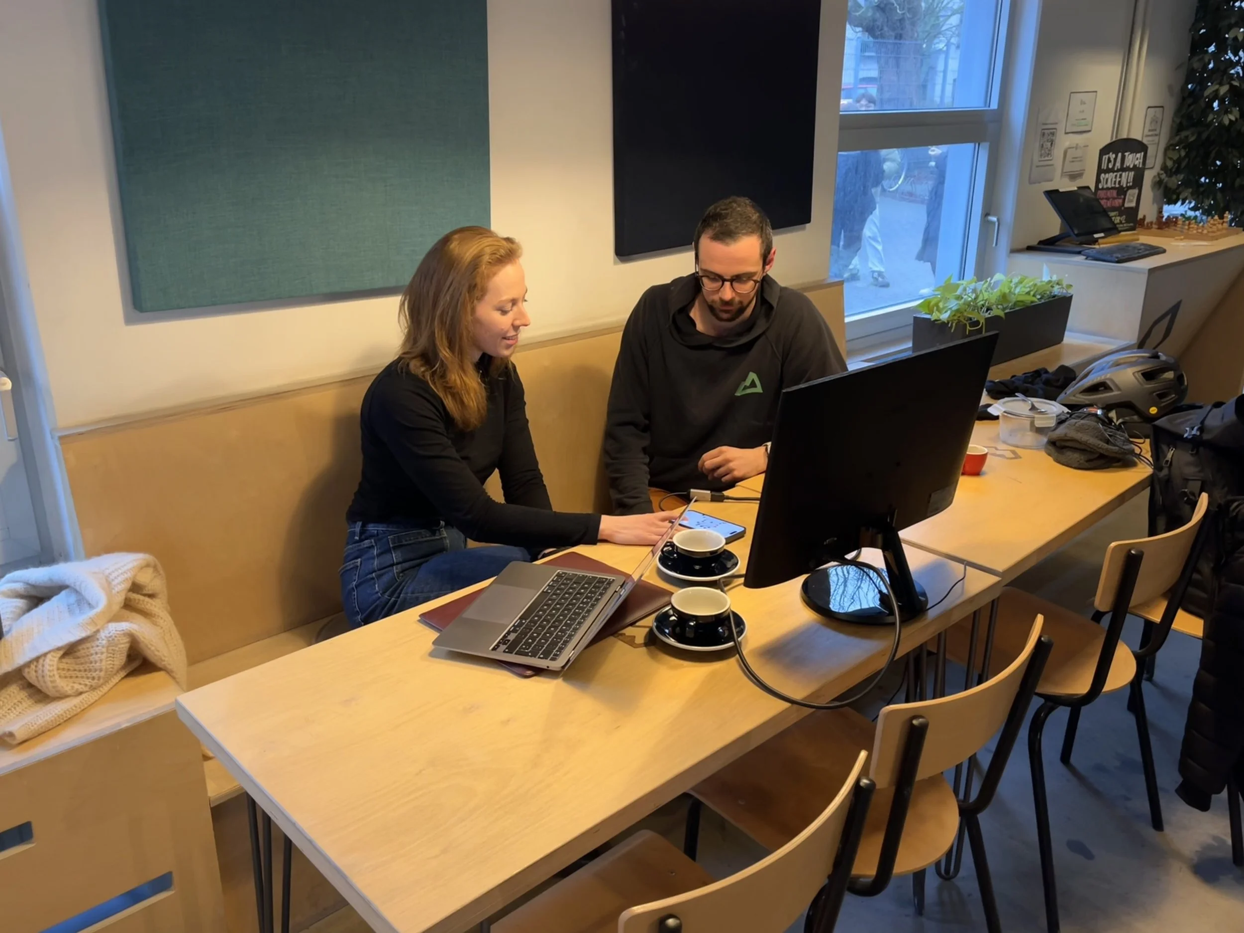
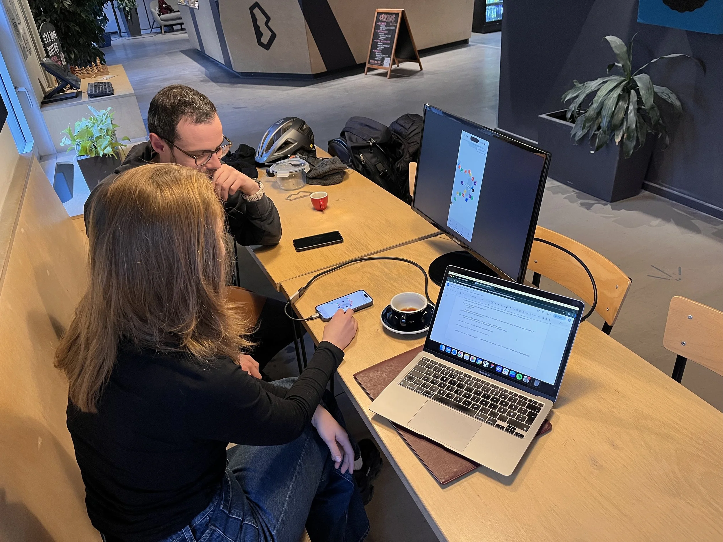
Being able to user test with key users is paramount to create a good user experience. Here I am testing with the head route setter at a climbing gym in Copenhagen. During the test I realised a few things, but most importantly I wanted to focus on these elements that I will elaborate on in this case study:
Route setters value efficiency. Our current route setting flow was in some ways too lengthy and needed fewer steps.
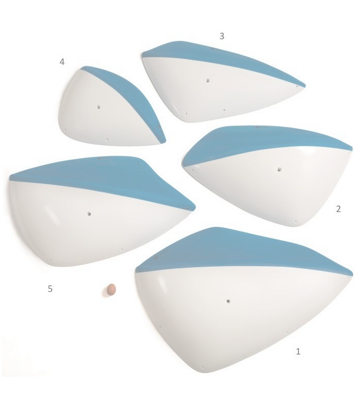
Sometimes gyms operate with multicoloured holds. This feature totally skipped my mind in the initial content planning stage, highlighting the importance of user testing early in order to include it in the design before production.
Multicoloured holds.A route setter testing the current version with me.A route setter testing the current version with me.Make it snappy!
Route setters value efficiency. Our current route setting flow was in some ways too lengthy and needed fewer steps.
Route setters have setting sessions up to several times per week. Sometimes they create over 100 routes!
Routes do not always need a label
Routes do not always need a grade
More often than not, a route is not a part of a competition.
This leaves us with one important discovery:
The minimum information needed to place a route is its colour.
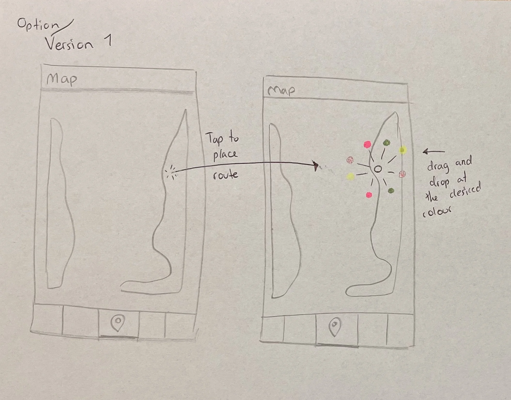
Option 1
You click/tap on a wall, and circular colour-picking menu appears. From here you can drag towards the colour you need.
A sketch illustrating option 1Option 2
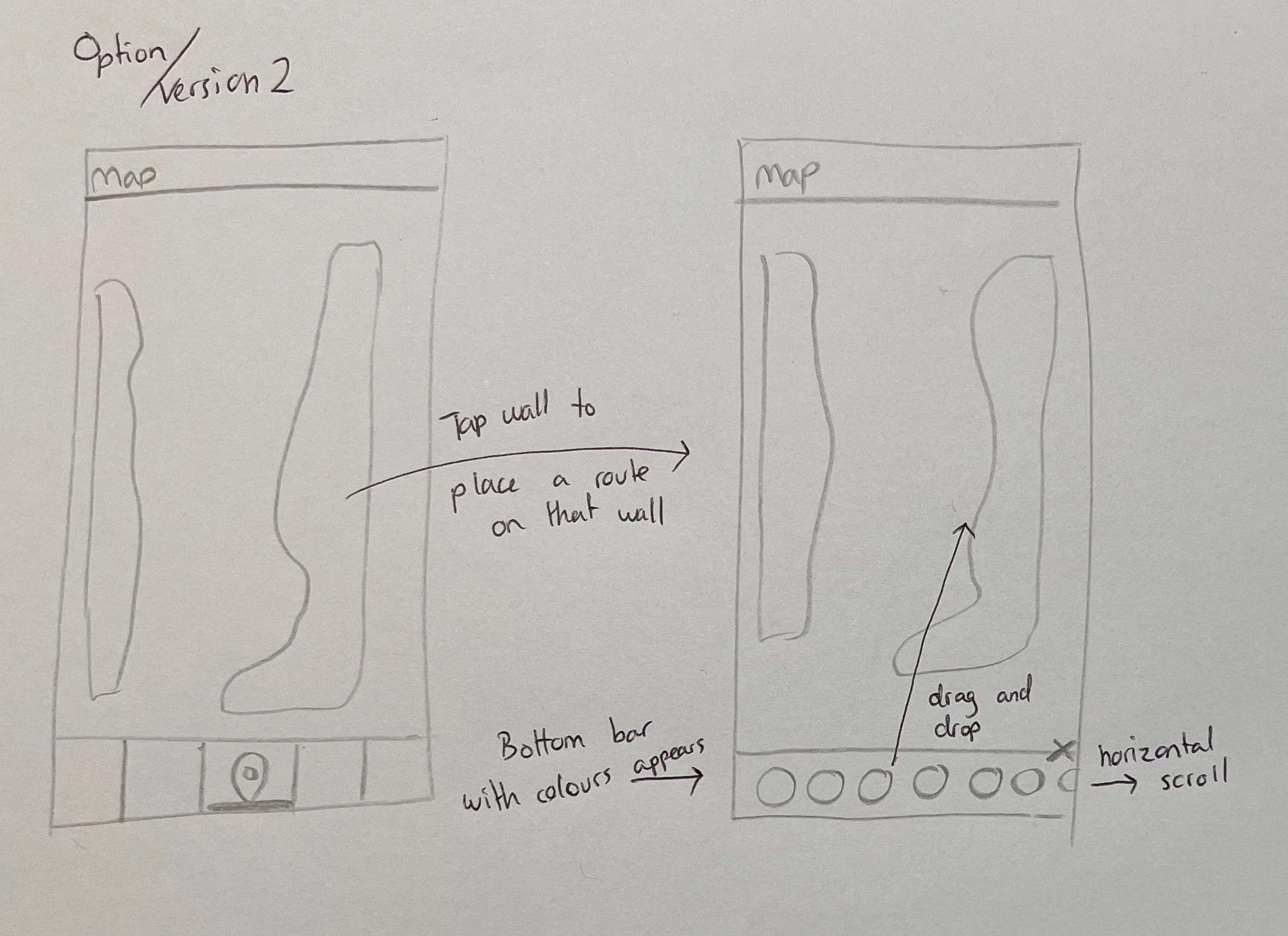
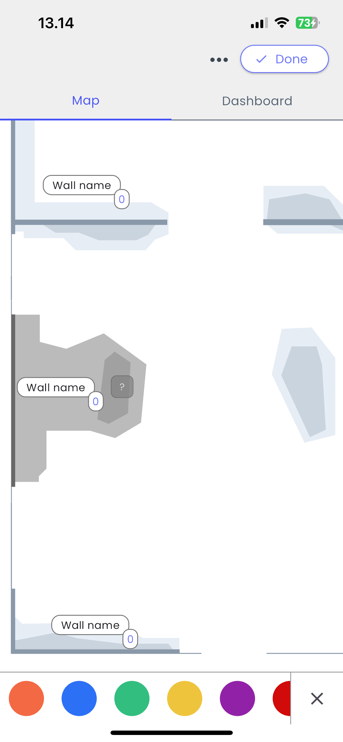
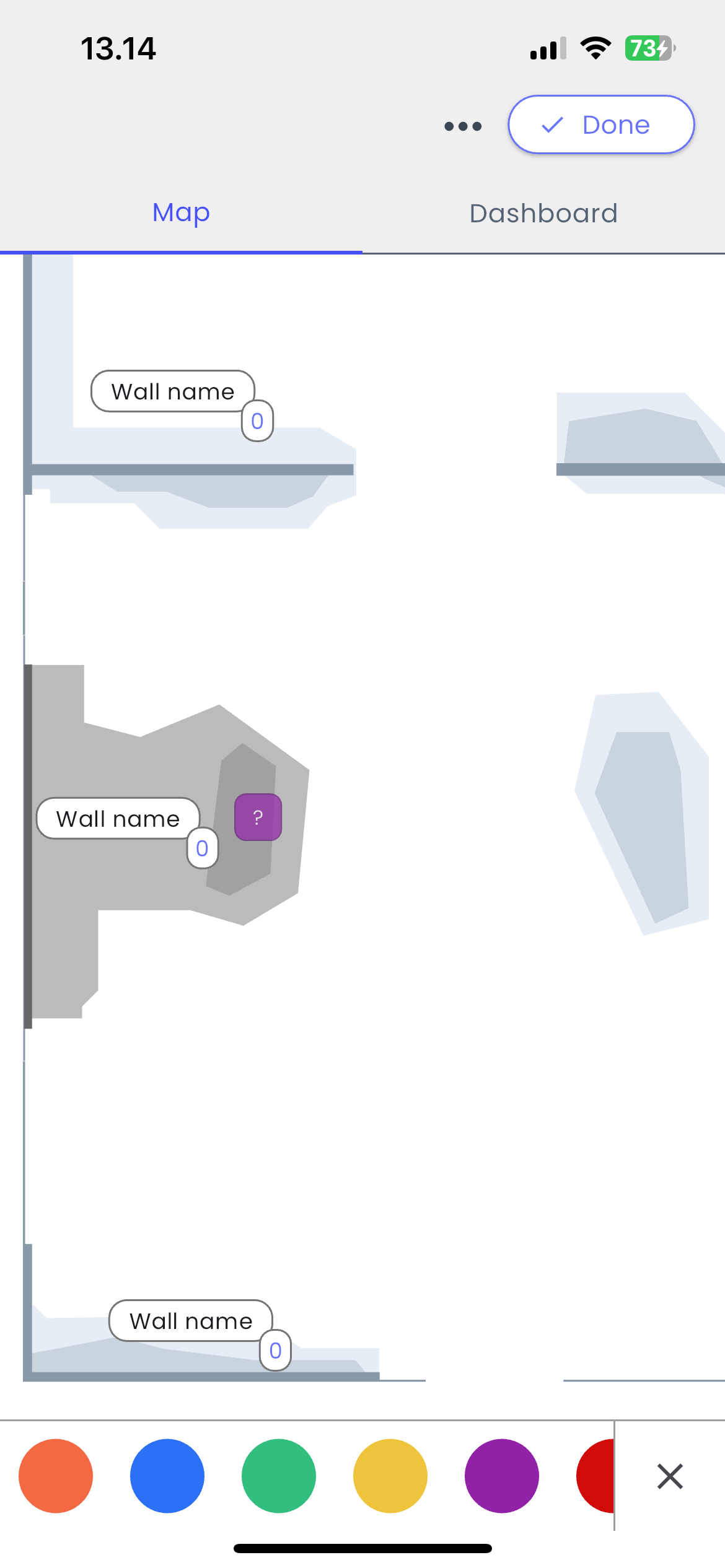
You click/tap on a wall, and a bottom bar of colours appears. From here you can drag and drop the correct colour you need.
A sketch illustrating option 2After discussing pros and cons we landed on the bottom bar as the best option for two main reasons:
The circular menu would take up too much space on the screen.
The circular menu could lead to unexpected behavior depending on where the user clicks on the screen. For example, how would the menu function if the user clicks in a corner?
In addition - a bottom bar like this would offer the user more thumb space to play around with. And a drag-and-drop from this position would be ideal.
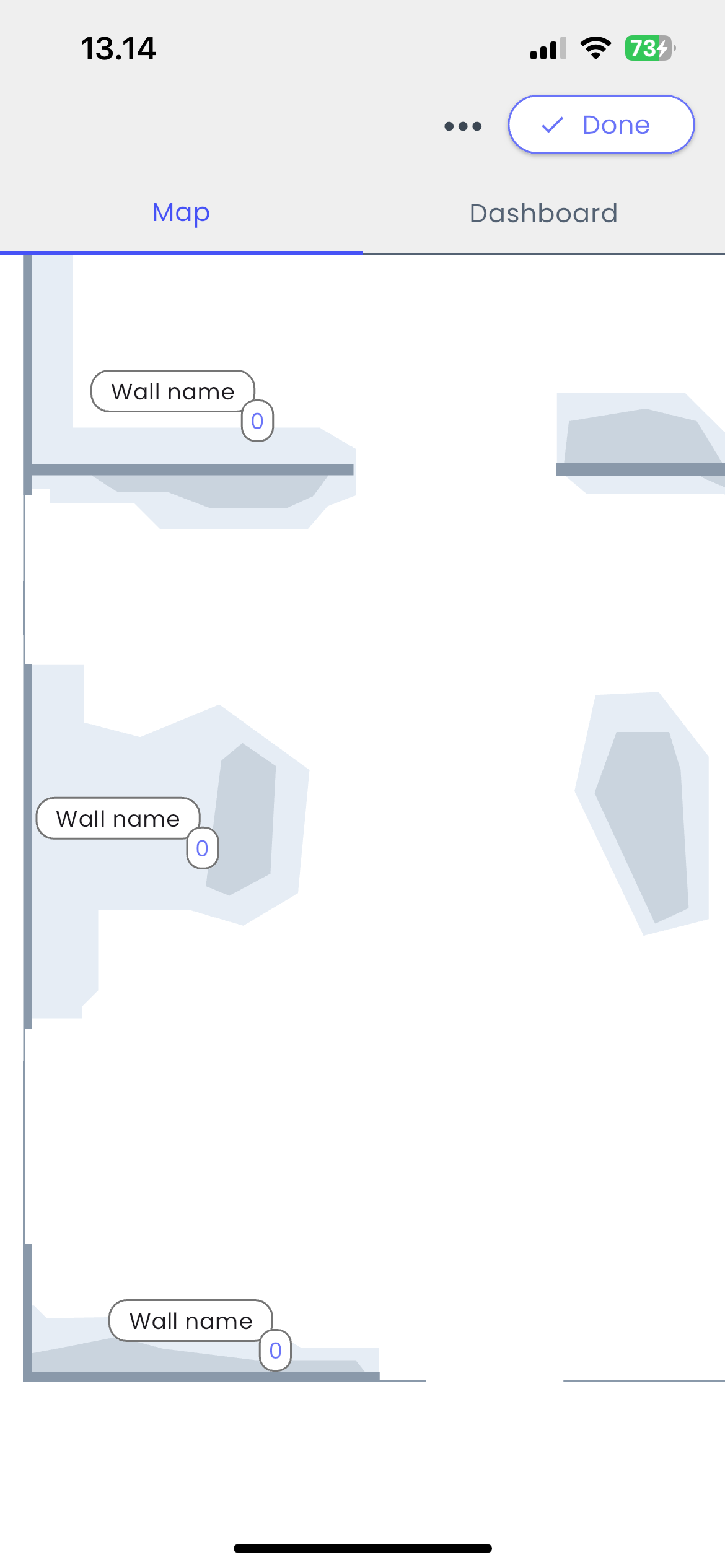
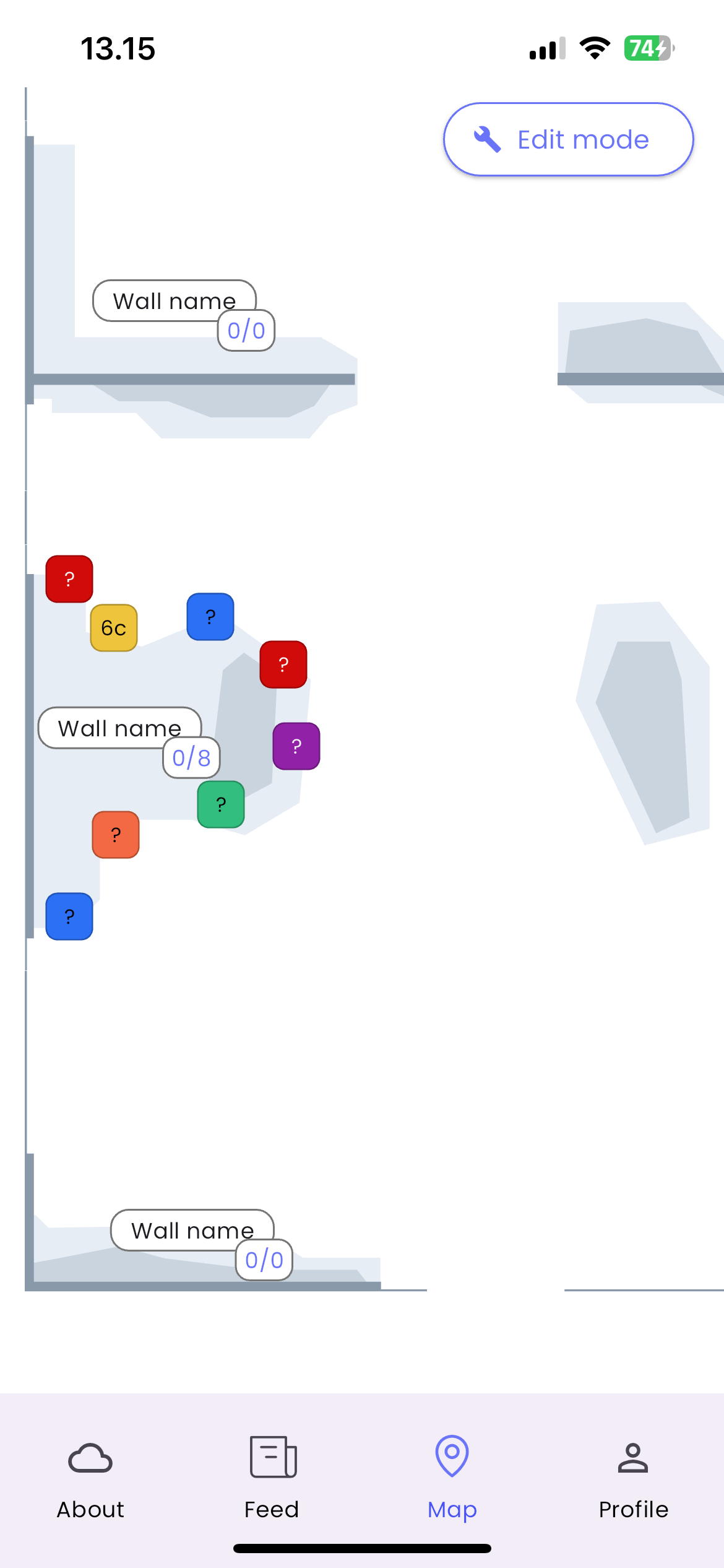
1. The route setter selects a wall on which she/he wants the route to be placed.2. The wall colour darkens and a route is placed. A bar with colour appears at the bottom of the screen.3. The route setter chooses the desired colour (here purple). 4. The route setting process is snappy and placing multiple routes takes seconds. Customisation of each route is still possible when you click on a specific route.What about multicolours?
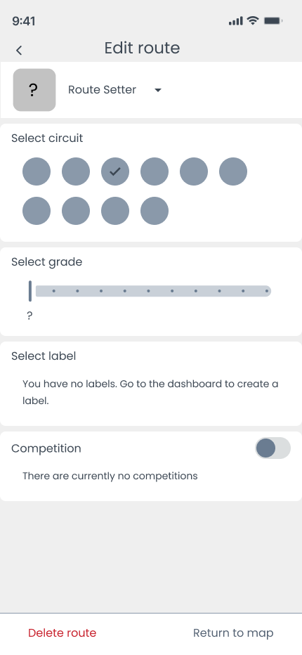
Sometimes gyms operate with multicoloured holds. This feature totally skipped my mind in the initial content planning stage, highlighting the importance of user testing early in order to quickly include it in the design.
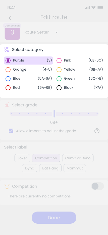
First iteration:
In the first iteration of the design, I overlooked the inclusion of multicoloured holds, as they are not very common. However, for the gyms using these holds, there has to be an option to accommodate this.
Iteration 1Second iteration:
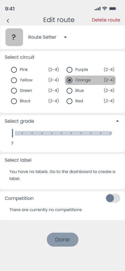
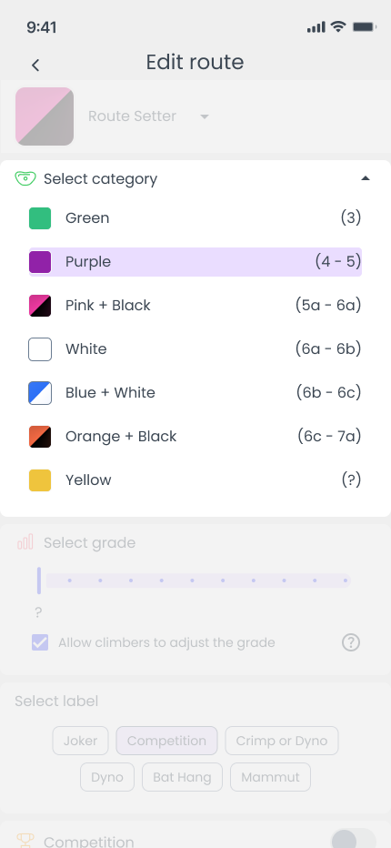
When revisiting the design, including multicoloured holds made it impossible to fit everything in two columns, and the custom radio buttons appeared visually cluttered when displaying two colours.
Iteration 2Third iteration:
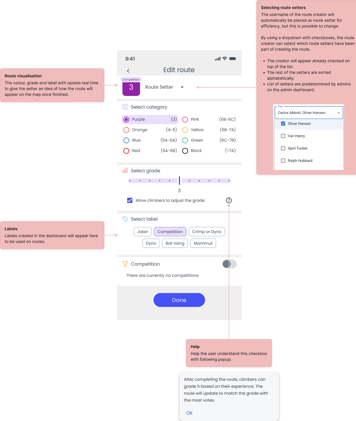
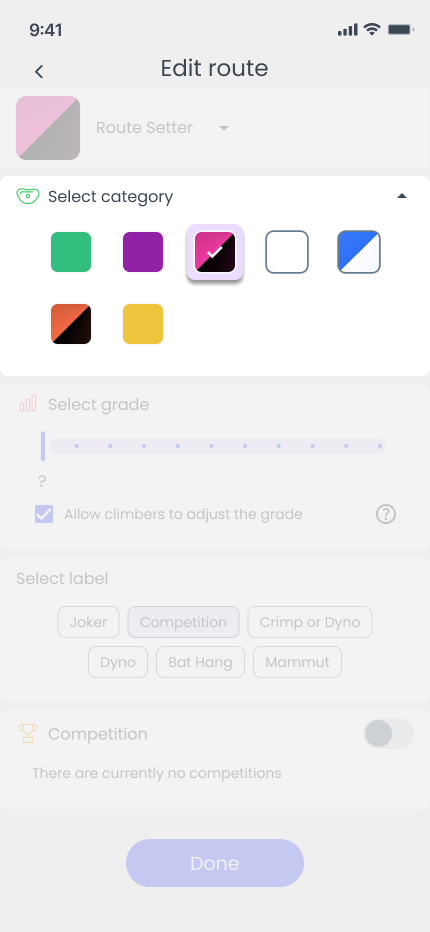
I later learned that route setters do not need to see the grade range (displayed on the right hand side), and simply only need the colour. This made it easier to save vertical space, and improve scanability when setting a route.
Iteration 3Design process summary
1. Research and User Flow Mapping
I begin by conducting thorough research to understand user needs and behaviors. This helps me map out an initial user flow to identify key steps and interactions.
2. Visualizing the Process
I create a simple flow diagram to visualize the process, clarifying which wireframes need to be sketched and what content should be included.
3. Rapid Ideation and Prototyping
I quickly sketch and experiment with different solutions to explore potential directions and gain a deeper understanding of how the final solution might take shape.
4. Further Research and Testing
I conduct additional research and usability testing to uncover pain points and areas for improvement in the current design.
5. Iteration and Refinement
Based on feedback and insights, I refine and iterate on the solutions, ensuring the design evolves to meet user needs and expectations effectively.
Wrap up thoughts
I have learned the value of being “hands on” in the field, to get first hand knowledge of the environment the users operate in. In the future, being able to see how users interact with the product in these environments will grant even better insights for iterations and improvements.
